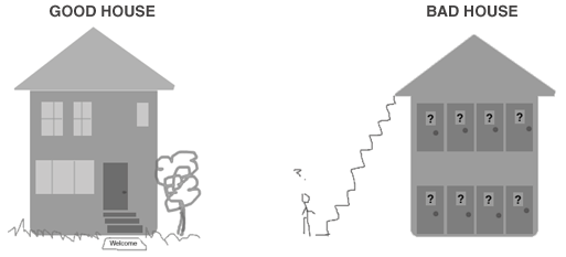
Your house, like mine, probably consists of entries, rooms, hallways, closets, and miscellaneous items to help us run our daily lives. When you open the bathroom door, you expect a toilet, not a wandering herd of donkeys in gorilla costumes.
I’d say a good 99% of us like our homes to be laid out in such a way as to enhance our everyday living – we expect and/or require them to have some modicum of functionality.

Web sites should be the same way. Even a visitor who’s never been to the site before should immediately get a feel for where they are, where they can go, and what information will be waiting for them when they navigate away from their current spot.
My question is: Why do so many architects have dysfunctional websites?
Here are just a few examples:
- Nobel Prize winning architect Zaha-Hadid. Why do I like a blindfolded mouse in a lab maze? The navigation is designed like a tangled knot of electrical cords.
- Alison Brooks Architects. It starts with an epileptic fit of barely visible words on ill-looking chartreuse canvas. When I enter the site, I can’t scroll down to see all the navigation and content. Oh well, I don’t care if you did win the Riba Manser Medal for the Salt House.
- Yamasaki Inc., the founder of which designed the old World Trade Center. This site is totally broken when viewed in Firefox. When I open it in Explorer, the navigation literally jumps away from me.
Architects take note: your online visitors are opening doors that lead to brick walls.
(P.S. ArcStone has been blueprinting websites for over 10 years.)
Topics: